In this Python tutorial, we will discuss Matplotlib 3D scatter in python. Here we will cover different examples related to the 3D scatter using matplotlib. And we will also cover the following topics:
- Matplotlib 3D scatter plot
- Matplotlib 3D scatter plot example
- Matplotlib 3D scatter color
- Matplotlib 3D scatter with colorbar
- Matplotlib 3D scatter marker size
- Matplotlib 3D scatter label
- Matplotlib 3D scatter legend
- Matplotlib 3D scatter plot color by value
- Matplotlib 3D scatter rotate
- Matplotlib 3D scatter change view angle
- Matplotlib 3D scatter title
- Matplotlib 3D scatter text
- Matplotlib 3D scatter with line
- Matplotlib 3D scatter with surface
- Matplotlib 3D sactter transparency
- Matplotlib 3D sactter depthshade
- Matplotlib 3D scatter axis limits
- Matplotlib 3D scatter axis ticks
- Matplotlib 3D scatter size
- Matplotlib 3D scatter grid
- Matplotlib 3D scatter subplot
- Matplotlib 3D scatter save
- Matplotlib 3D scatter background color
- Matplotlib 3D scatter numpy array
- Matplotlib 3D scatter marker color
- Matplotlib 3D scatter zlim
- Matplotlib 3D scatter z label
- Matplotlib 3D scatter xlim
- Matplotlib 3D scatter zoom
- Matplotlib 3D scatter origin
- Matplotlib 3D scatter log scale
- Matplotlib 3D scatter dataframe
- Matplotlib 3D scatter animation
Table of Contents
Matplotlib 3D scatter plot
In this section, we learn about how to plot a 3D scatter plot in matplotlib in Python. Before starting the topic, firstly we have to understand what does 3D and scatter plot means:
“3D stands for Three-Dimensional. “
Any object in the real world having Three-Dimensions is known as 3D object. Having Three-Dimensions means height, width and depth.
Scatter plot is a graph in which the values of variables are plotted along the axes, by using the points.
A 3D Scatter Plot is a mathematical diagram, used to display the properties of data as three variables using the cartesian coordinates. In matplotlib to create a 3D scatter plot, we have to import the mplot3d toolkit.
The scatter3D() function of the matplotlib library, which accepts X, Y, and Z data sets, is used to build a 3D scatter plot.
The following steps are used to draw a 3D scatter plot are outlined below:
- Defining Libraries:Import the most important library which is required to plot 3D graphs mplot3d toolkit and also import other libraries which are required for data creation and manipulation numpy and pandas, for data visualization: pyplot from matplotlib.
- Define X and Y: Define the data coordinates values used for the x-axis and y-axis data plotting.
- Plot 3D scatter plot: By using scatter3D() method of the matplotlib library we can draw 3D scatter plot.
- Visulaize a Plot: By using show() method user can generate a plot on their screen.
Matplotlib 3D scatter plot example
# Import Libraryfrom mpl_toolkits import mplot3d# Function to create 3D scatter plotmatplotlib.axes.Axis.scatter3D(x, y, z)Here x, y, and z represent the Three-Dimensions of the plot.
Let’s see an example to understand the concept more clearly:
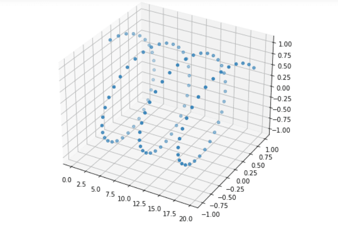
# Import librariesfrom mpl_toolkits import mplot3dimport numpy as npimport matplotlib.pyplot as plt # Define Datax = np.arange(0, 20, 0.2)y = np.sin(x)z = np.cos(x) # Create Figurefig = plt.figure(figsize = (10, 7))ax = plt.axes(projection ="3d") # Create Plotax.scatter3D(x, y, z) # Show plotplt.show()- In the above example, we import mplot3d toolkits, numpy, and pyplot libraries.
- Next, we define data using arange(), sin(), and cos() method.
- plt.figure() method is used to set figure size here we pass figsize as a parameter and plt.axes() method is used to set axes and here we pass projection as a parameter.
- ax.scatter3D() method is used to create 3D scatter plot, here we pass x, y, and z as parameter.
- plt.show() method is used to generate graph on user screen.
Read: Matplotlib plot_date
Matplotlib 3D scatter color
In this section, we are going to learn how to change the color of the 3D scatter plot.
The syntax to change the color is given below:
matplotlib.axes.Axis.scatter3D(x, y, z, color=None)- x: specify x-coordinates of the axes.
- y: specify y-coordinates of the axes.
- z: specify z-coodinates of the axes.
- color: specify color of the scatter.
Let’s see an example where we change the color of the 3D scatters:
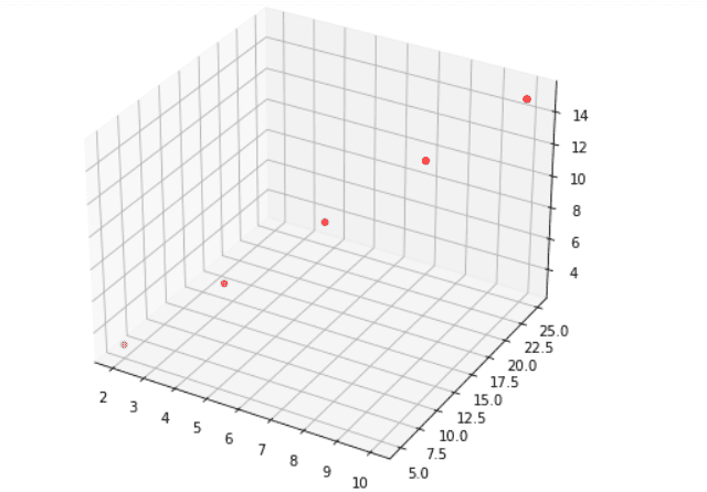
# Import librariesfrom mpl_toolkits import mplot3dimport numpy as npimport matplotlib.pyplot as plt # Define Datax = [2, 4, 6, 8, 10]y = [5, 10, 15, 20, 25]z = [3, 6, 9, 12, 15] # Create Figurefig = plt.figure(figsize = (10, 7))ax = plt.axes(projection ="3d") # Create Plot and change colorax.scatter3D(x, y, z, color='red') # Show plotplt.show()- In the above example, we import mplot3d toolkits, numpy, and pyplot libraries.
- Next, we define data.
- plt.figure() method is used to set figure size here we pass figsize as a parameter and plt.axes() method is used to set axes and here we pass projection as a parameter.
- ax.scatter3D() method is used to create 3D scatter plot, here we pass x, y, z and color as parameter. Here color change the color of the plot.
- plt.show() method is used to generate graph on user screen.
Read: Matplotlib dashed line
Matplotlib 3D scatter with colorbar
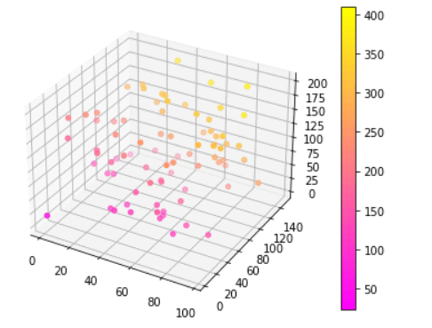
Here we draw a 3D scatter plot with a color bar. By using the get_cmap() method we create a colormap.
The syntax to plot color bar:
# Create scatter Plotmatplotlib.axis.Axis.scatter3D(x, y, z, cmap)# To Plot colorbarmatplotlib.pyplot.colorbar(mappable=None, cax=None, ax=None, label, ticks)Here cmap specify the color map.
Example:
# Import librariesfrom mpl_toolkits import mplot3dimport numpy as npimport matplotlib.pyplot as plt # Define Datasetx = np.random.randint(100,size=(80))y = np.random.randint(150, size=(80))z = np.random.randint(200, size=(80)) # Creating figurefig = plt.figure(figsize = (16, 9))ax = plt.axes(projection ="3d") # Creat color mapcolor_map = plt.get_cmap('spring') # Create scatter plot and colorbarscatter_plot = ax.scatter3D(x, y, z, c=(x+y+z), cmap = color_map) plt.colorbar(scatter_plot) # Show plotplt.show()- In the above example, we import mplot3d toolkits, numpy, and pyplot libraries.
- Next, we define data using random.randint() method.
- plt.axes() method is used to set axes and here we pass projection as a parameter.
- plt.get_cmap() method is used to create color map of the specific color.
- ax.scatter3D() method is used to create 3D scatter plot, here we pass x, y, z and cmap as parameter. Here cmap define the color map.
- fig.colorbar() method is used to add colorbar to a plot that indicates the color scale.
Read: Matplotlib scatter marker
Matplotlib 3D scatter marker size
Here we are going to learn how we can change the marker and marker size of the 3D scatter plot in matplotlib.
The syntax to change the marker size is given below:
matplotlib.axis.Axis.scatter(x, y, z, s=None, marker=None)The parameters used above are:
- x: specify the data position on x-axis.
- y: specify the data position on y-axis.
- s: specify the marker size in points**2.
- marker: specify marker style.
Let’s see an example where we change the scatter marker and its size:
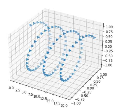
# Import librariesfrom mpl_toolkits import mplot3dimport numpy as npimport matplotlib.pyplot as plt # Define Datax = np.arange(0, 20, 0.2)y = np.sin(x)z = np.cos(x) # Create Figurefig = plt.figure(figsize = (8,6))ax = plt.axes(projection ="3d") # Create Plotax.scatter3D(x, y, z, marker= '>', s=50) # Show plotplt.show()Here we use an ax.scatter() method to create a scatter plot and we pass marker and s as parameters to change marker style and marker size respectively. We set the marker size to 50.
Read: Matplotlib change background color
Matplotlib 3D scatter label
Here we are going to learn how to add labels to the 3D scatter graph.
The syntax to add label is given below:
# To add x-axis labelax.set_xlabel()# To add y-axis labelax.set_ylabel()# To add z-axis labelax.set_zlabel()Example:
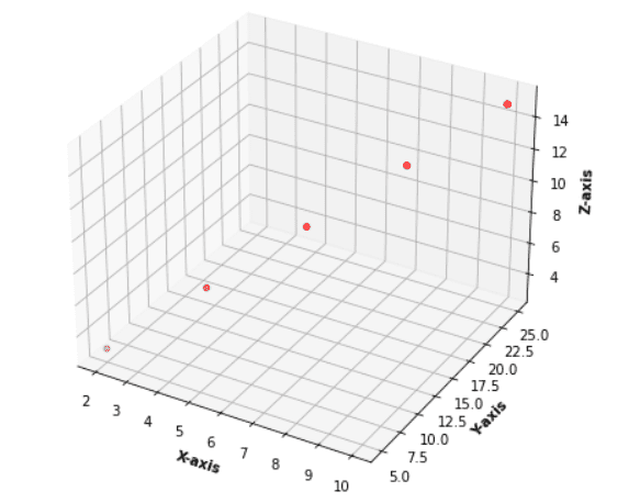
Here we use ax.scatter3D() function to plot 3D scatter plot.
ax.set_xlabel(), ax.set_ylabel(), and ax.set_zlabel() function is used to add labels to the plot. We pass X-axis, Y-axis, and Z-axis to respective functions.
Code:
# Import librariesfrom mpl_toolkits import mplot3dimport numpy as npimport matplotlib.pyplot as plt # Define Dataz = [3, 6, 9, 12, 15]x = [2, 4, 6, 8, 10]y = [5, 10, 15, 20, 25] # Create Figurefig = plt.figure(figsize = (10, 7))ax = plt.axes(projection ="3d") # Create Plotax.scatter3D(x, y, z, color='red')# Add axisax.set_xlabel('X-axis', fontweight ='bold')ax.set_ylabel('Y-axis', fontweight ='bold')ax.set_zlabel('Z-axis', fontweight ='bold') # Show plotplt.show()Output:
Also, check: Matplotlib rotate tick labels
Matplotlib 3D scatter legend
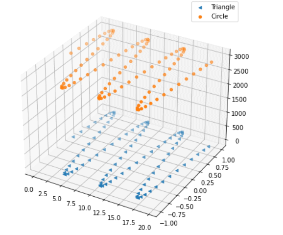
Here we learn how to add a legend to the 3D scatter plot. By using the legend() function we can easily add.
Example:
# Import librariesfrom mpl_toolkits import mplot3dimport numpy as npimport matplotlib.pyplot as plt # Define Datax = np.arange(0, 20, 0.2)y = np.sin(x)z1 = np.cos(x)z2 = np.exp(8) # Create Figurefig = plt.figure(figsize = (10, 7))ax = plt.axes(projection ="3d") # Create Plotax.scatter3D(x, y, z1, marker='<', s=20, label='Triangle')ax.scatter3D(x, y, z2, marker='o', s=20, label='Circle' )# Add legendax.legend(loc=1) # Show plotplt.show()- Here we plot 3d scatter graph between x, y and z1 axes and x, y , and z2 axes.
- By using the ax.sactter3D() method we plot 3D sactter graph and we pass label as a parameter.
- ax.legend() method is use to add legend to the plot.
Read: Matplotlib remove tick labels
Matplotlib 3D scatter plot color by value
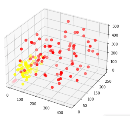
Here we are going to learn how we can plot a 3D scatter plot for different data and color by value.
Let’s see an example to understand the concept more clearly:
# Import librariesfrom mpl_toolkits import mplot3dimport numpy as npimport matplotlib.pyplot as plt# Define Datax1 = np.random.randint(450,size=(80))y1 = np.random.randint(260, size=(80))z1 = np.random.randint(490, size=(80))x2 = np.random.randint(100,size=(50))y2 = np.random.randint(150, size=(50))z2 = np.random.randint(200, size=(50))x3 = [3, 6, 9, 12, 15]y3 = [2, 4, 6, 8, 10]z3 = [5, 10, 15, 20, 25]# Create Figurefig = plt.figure(figsize = (8,6))ax = plt.axes(projection ="3d") # Create Plotax.scatter3D(x1, y1, z1, s=50, color='red')ax.scatter3D(x2, y2, z2, s=50, color='yellow')ax.scatter3D(x3, y3, z3, s=50, color='pink')# Show plotplt.show()- Here we plot a 3D scatter plot using three different data sets.
- Then by using the ax.scatter3D() function we plot scatter plots for different datasets.
- Bypassing color as a parameter we color the scatter plot by values.
Also, read: Matplotlib plot error bars
Matplotlib 3D scatter rotate
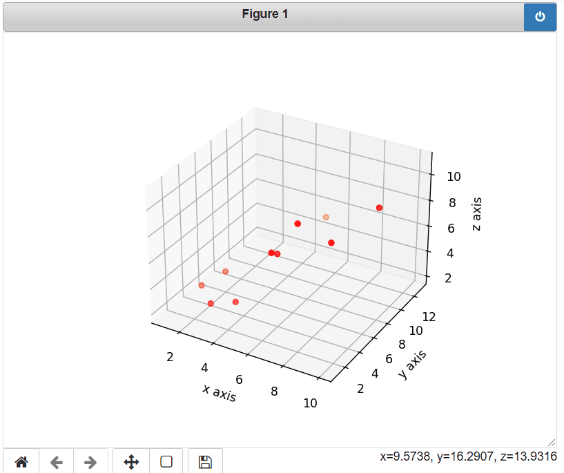
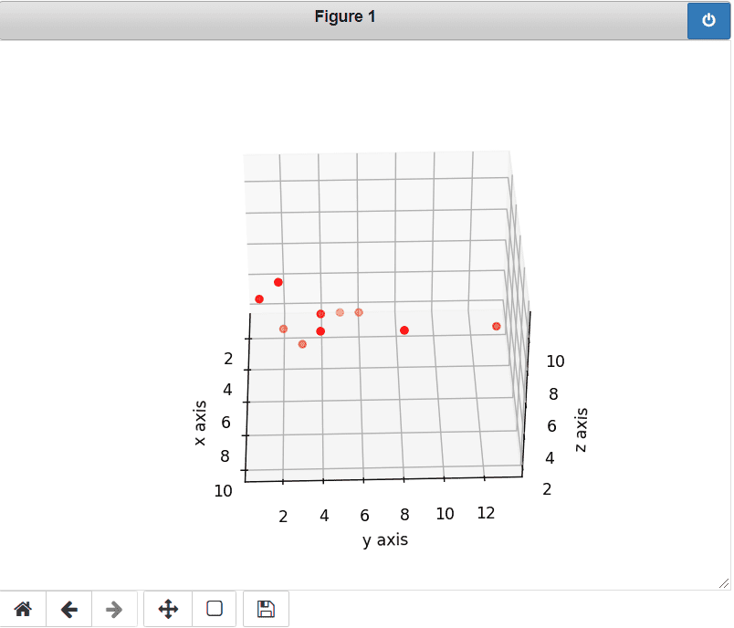
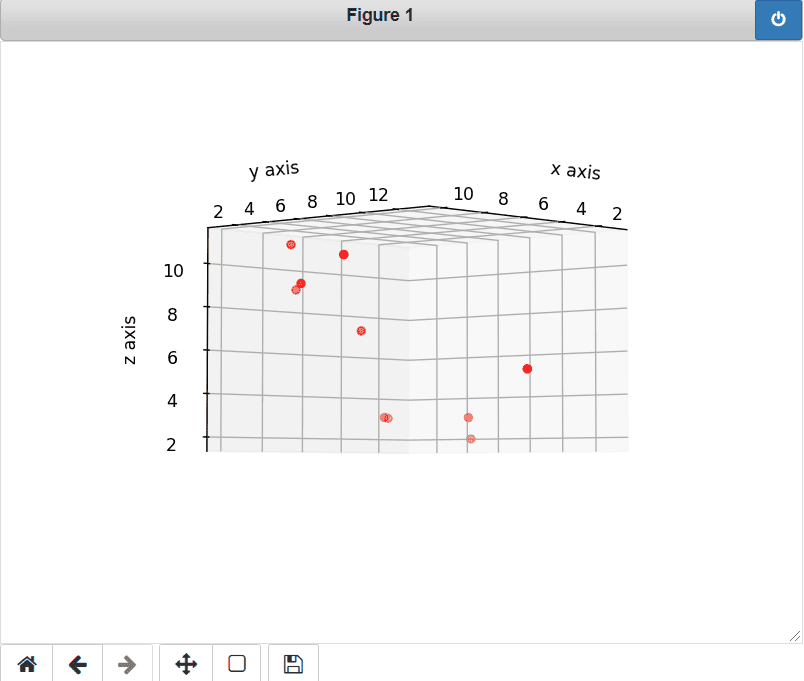
Here we are going to learn how we can rotate the 3D scatter plot by moving the mouse only.
To turn on the interactivity or to rotate 3D scatter plot using mouse use this line in your code:
%matplotlib notebookLet’s see an example:
# Interactive Mode%matplotlib notebook# Import Libraryfrom mpl_toolkits.mplot3d import Axes3Dimport matplotlib.pyplot as plt# Create Plotfig = plt.figure()ax = fig.add_subplot(111, projection='3d')# Define DataX = [1,2,3,4,5,6,7,8,9,10]Y = [5,6,2,3,13,4,1,2,4,8]Z = [2,3,3,3,5,7,9,11,9,10]# Plot 3D scatter Plotax.scatter(X,Y,Z, c='r', marker='o')# Define Labelax.set_xlabel('x axis')ax.set_ylabel('y axis')ax.set_zlabel('z axis')# Displayplt.show()- In the above example, we enable the Interactive Mode from the backend.
- Next, we import libraries mplot3D and pyplot.
- Then we create a plot and define data.
- ax.scatter3D() method is used to plot 3D scatter graph.
- set_xlabel(), set_ylabel, and set_zlabel() method is used to add labels to the plot.
- plt.show() method is used to display plot the user screen.
Read: Add text to plot matplotlib in Python
Matplotlib 3D scatter change view angle
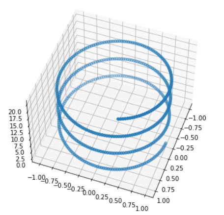
Here we can learn how we can view 3D scatter graphs from different angles. By using the view_init() method we can change the view angle.
The syntax to change view angle is given below:
matplotlib.axis.Axis.view_init(elev,azim)The parameter used above is given below:
- elev: specify the elevation angle in the z plane.
- azim: specify the azimuth angle in the x,y plane.
Let’s see an example where we change the view angle:
# Import Libraryfrom mpl_toolkits import mplot3dimport numpy as npimport matplotlib.pyplot as plt# Plotting 3D axis figuresfig = plt.figure(figsize = (8,8))ax = plt.axes(projection = '3d') # Define Dataz = np.linspace(0, 20, 500)x = np.sin(z)y = np.cos(z)ax.plot3D(x, y, z, 'green')# Change view angleax.view_init(50, 20)# Displayplt.show()- In this example, we import mplot3d, numpy, and pyplot library.
- Then we plot the 3D axis figure by using plt.figure() and plt.axes() method and we also pass figsize and projection as a parameter respectively.
- After this, we create a dataset for the three axes.
- ax.scatter3D() method is used to plot 3D scatter graph.
- view_init() method is used to change the view angle.
Output: Plot without rotation.

Output: Plot a 3D scatter graph with an elevated angle of 50 degrees and a horizontal angle of 20 degrees.
Read: Matplotlib save as png
Matplotlib 3D scatter title
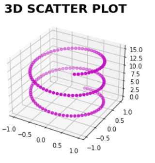
Here we are going to learn how to plot 3D scatter plot with the title.
The syntax to add a title to the 3D scatter plot:
matplotlib.pyplot.title()Let’s see an example:
# Import Libraryfrom mpl_toolkits import mplot3dimport numpy as npimport matplotlib.pyplot as plt# Plotting 3D axis figuresfig = plt.figure(figsize = (6,4))ax = plt.axes(projection = '3d') # Define Dataz = np.linspace(0,15,150)x = np.sin(z)y = np.cos(z)# Plot 3D scatter ax.scatter3D(x, y, z, color='m')# Add Titleplt.title('3D SCATTER PLOT', fontweight='bold', size=20)# Displayplt.show()- In the above example, we import mplot3d, numpy, and pyplot library.
- Next, we define data using linespace(), sin(), and cos() method.
- ax.scatter3D() method is used to draw scatter plots.
- plt.title() method is used to add the title to the 3D scatter plot.
Read: Matplotlib bar chart labels
Matplotlib 3D scatter text
Here we are going to learn how to add text to the 3D scatter plot. By using the ax.text() method we can do it.
Let’s see an example where we add text in 3D scatter plot at a fixed position:
# Import librariesfrom mpl_toolkits import mplot3dimport numpy as npimport matplotlib.pyplot as plt # Define Dataz = [3, 6, 9, 12, 15]x = [2, 4, 6, 8, 10]y = [5, 10, 15, 20, 25]# Create Figurefig = plt.figure(figsize = (10, 7))ax = plt.axes(projection ="3d") # Create Plotax.scatter3D(x, y, z)# Add axisax.set_xlabel('X-axis')ax.set_ylabel('Y-axis')ax.set_zlabel('Z-axis')# Add Textax.text3D(6, 4, 10,"Point 2") # Show plotplt.show()- Here we first define the data for plotting, then by using the ax.scatter() function we plot 3D scatter graph.
- ax.text() method is used to add text to the plot at a fixed location. We pass three locations (x, y, z axes) where text is placed and the text which we want to add.

Read: Matplotlib default figure size
Matplotlib 3D scatter with line
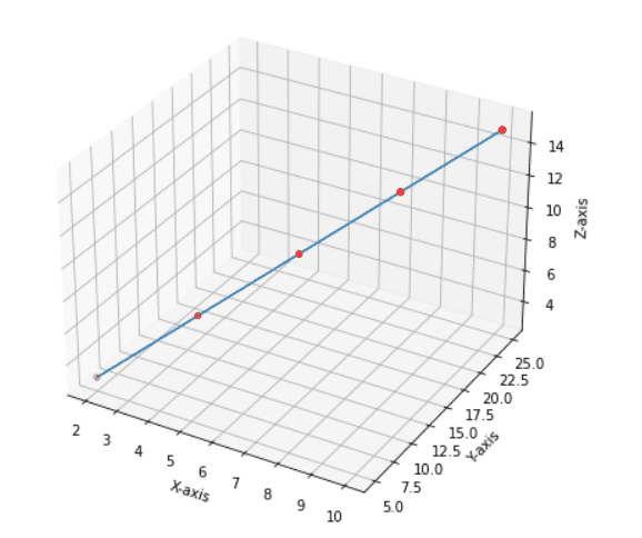
Here we are going to learn how we can plot a 3D scatter graph with line. To connect scatter points, we use the plot3D() method with x, y, and z data points.
Let’s see an example where we plot a 3D scatter graph with the line:
# Import librariesfrom mpl_toolkits import mplot3dimport numpy as npimport matplotlib.pyplot as plt # Define Dataz = [3, 6, 9, 12, 15]x = [2, 4, 6, 8, 10]y = [5, 10, 15, 20, 25] # Create Figurefig = plt.figure(figsize = (10, 7))ax = plt.axes(projection ="3d") # Create Plotax.scatter3D(x, y, z, color='red')# Add lineax.plot3D(x,y,z)# Add axisax.set_xlabel('X-axis')ax.set_ylabel('Y-axis')ax.set_zlabel('Z-axis')# Show plotplt.show()- By using figure() function we create a new figure and add an axes to the current figure as a subplot.
- Define the data points x, y, and z.
- ax.scatter3D() function is use to plot scatter 3D plot.
- ax.plot3D() function is used to connect the points with x, y, and z data points.
- plt.show() method is use to display the figure.
Read: Matplotlib savefig blank image
Matplotlib 3D scatter with surface
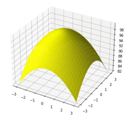
Here we are going to learn how to plot a 3D scatter graph with a surface. Firstly, we have to understand what is Surface Plot:
A Surface Plot is a representation of a three-dimensional dataset. It represents the relationship between two variables X and Z and the dependent variable Y.
The ax.plot_surface() function is used to create surface plots.
The syntax of the given method is given below:
matplotlib.axis.Axis.plot_surface(X, Y, Z)Where X, Y, and Z are three-dimensional data coordinates points.
Let’s see an example of 3D scatter with the surface:
# Import librariesfrom mpl_toolkits import mplot3dimport numpy as npimport matplotlib.pyplot as plt# Define Functiondef function_z(x,y): return 100 - (x**2 + y**2)# Define Datax_val = np.linspace(-3, 3, 30)y_val = np.linspace(-3, 3, 30)X, Y = np.meshgrid(x_val, y_val)# Call functionz = function_z(X, Y)# Create figurefig = plt.figure(figsize =(10,6))ax = plt.axes(projection='3d')# Create surface plotax.plot_surface(X, Y, z, color='yellow');# Displayplt.show()- In the above example, firstly we import matplotlib.pyplot, numpy, and mplot3D.
- Next we create a user define function for z coordinate.
- Then by using np.linspace() function we define data for x and y coordinates.
- By using plt.figure() method we create a function and plt.axes() method to define axes.
- ax.plot_surface() method is used to plot 3D scatter with surface.
- To dispaly the figure, use show() method.
Read: Matplotlib title font size
Matplotlib 3D scatter transparency
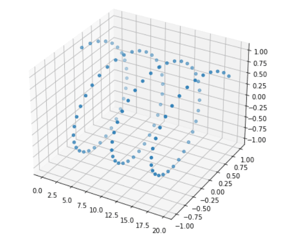
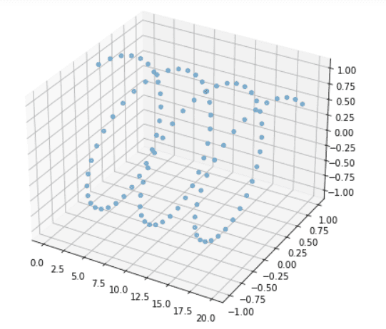
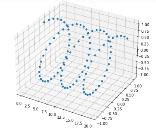
Here we will learn how to adjust the opacity or transparency of the 3D scatter plot. By using the alpha attribute we can change the transparency of the plot in matplotlib.
By default, alpha is 1. It ranges between 0 to 1. We can decrease the transparency by decreasing the value of alpha.
The syntax to change the transparency is given below:
matplotlib.axis.Axis.scatter3D(x, y, z, alpha=1)Here x, y, z are data coordinates, and alpha is used to set transparency.
Let’s see an example where we change the transparency of the plot:
# Import librariesfrom mpl_toolkits import mplot3dimport numpy as npimport matplotlib.pyplot as plt # Define Datax = np.arange(0, 20, 0.2)y = np.sin(x)z = np.cos(x) # Create Figurefig = plt.figure(figsize = (10, 7))ax = plt.axes(projection ="3d") # Create Plotax.scatter3D(x, y, z) # ORax.scatter3D(x, y, z, alpha=0) # ORax.scatter3D(x, y, z, alpha=0.5) # ORax.scatter3D(x, y, z, alpha=1) # Show plotplt.show()- In the above example, we define data using arange(), sin(), cos() method.
- By using the figure() function we create figure, axes() method is used to define projection to 3d.
- ax.scatter3D() method is used to plot 3D scatter graph, we pass alpha argument to change opacity.
Read: Matplotlib save as pdf + 13 examples
Matplotlib 3D sactter depthshade
In general, when we plot a 3D scatter graph, the data points’ transparency is adjusted by distance. This means that transparency increases and decreases by a distance of points.
So in general, we see some data points having dark colors and some are transparent.
By using the depthshade attribute we can turn off the transparency in matplotlib. To turn it off set its value to False.
The syntax is given below:
matplotlib.axis.Axis.scatter3D(x, y, z, depthshade=False)Let’s see an example:
# Import librariesfrom mpl_toolkits import mplot3dimport numpy as npimport matplotlib.pyplot as plt # Define Dataz = [3, 6, 9, 12, 15]x = [2, 4, 6, 8, 10]y = [5, 10, 15, 20, 25] # Create Figurefig = plt.figure(figsize = (10, 7))ax = plt.axes(projection ="3d") # Create Plotax.scatter3D(x, y, z, s=100, color='green', depthshade=False)# Add axisax.set_xlabel('X-axis')ax.set_ylabel('Y-axis')ax.set_zlabel('Z-axis')# Show plotplt.show()Here we use the ax.scatter3D() method to plot 3D scatter graph and we pass the depthshade attribute to turn off its transparency.
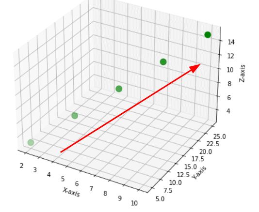
Here you see transparency in the 3D scatter plot.
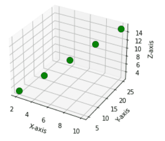
Here you see there is no transparency in data points.
Read: Put legend outside plot matplotlib
Matplotlib 3D scatter axis limit
Here we are going to learn how to change the axis limit of the 3D scatter plot. By default, the range of values on the axes is set automatically based on the input values.
To modify the minimum and maximum limit on each axis we use set_xlim(), set_ylim(), and set_zlim() methods.
The syntax to modify axis limits is given below:
# For x-axis limitmatplotlib.axis.Axis.set_xlim(min, max)# For y-axis limitmatplotlib.axis.Axis.set_ylim(min, max)# For z-axis limitmatplotlib.axis.Axis.set_zlim(min, max)Let’s see an example where we adjust axis limits:
Code: With default axis
# Import librariesfrom mpl_toolkits import mplot3dimport numpy as npimport matplotlib.pyplot as plt# Define Datax1 = np.random.randint(450,size=(80))y1 = np.random.randint(260, size=(80))z1 = np.random.randint(490, size=(80))# Create Figurefig = plt.figure(figsize = (8,6))ax = plt.axes(projection ="3d") # Create Plotax.scatter3D(x1, y1, z1, s=50, color='red')# Show plotplt.show()Here we draw a 3D scatter plot by using the ax.scatter3D() method. And we use np.random.randint() method to define data.
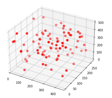
Code: With the modified axis
# Import librariesfrom mpl_toolkits import mplot3dimport numpy as npimport matplotlib.pyplot as plt# Define Datax1 = np.random.randint(450,size=(80))y1 = np.random.randint(260, size=(80))z1 = np.random.randint(490, size=(80))# Create Figurefig = plt.figure(figsize = (8,6))ax = plt.axes(projection ="3d") # Create Plotax.scatter3D(x1, y1, z1, s=50, color='red')# Modify axisax.set_xlim(50,150)ax.set_ylim(30,160)ax.set_zlim(0,350)# Show plotplt.show()Here we use set_xlim(), set_ylim(), set_zlim() methods to modify the limits for three axes based on min and max values passed.
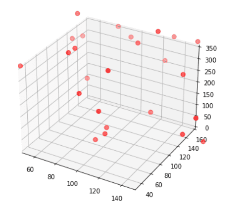
Read: Draw vertical line matplotlib
Matplotlib 3D scatter axis ticks
Here we are going to learn how to change axis ticks of a 3D scatter plot. We can modify the ticks for each axis. The methods used to modify ticks is set_xticks(), set_yticks(), set_zticks().
The syntax to modify axis limits is given below:
# For x-axis limitmatplotlib.axis.Axis.set_xticks()# For y-axis limitmatplotlib.axis.Axis.set_yticks()# For z-axis limitmatplotlib.axis.Axis.set_zticks()Let’s see an example where we adjust axis ticks:
Code: With default ticks
# Import librariesfrom mpl_toolkits import mplot3dimport numpy as npimport matplotlib.pyplot as plt # Define Datax = np.arange(0, 20, 0.2)y = np.sin(x)z = np.cos(x) # Create Figurefig = plt.figure(figsize = (8,6))ax = plt.axes(projection ="3d") # Create Plotax.scatter3D(x, y, z) # Show plotplt.show()Here we use ax.scatter3D() method to plot 3D scatter graph. To define data use arange(), sin(), and cos() methods.
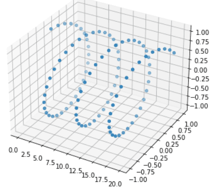
Here x-axis ticks are [0.0, 2.5, 5.0, 7.5, 10.0, 12.5, 15.5, 17.5, 20.0]
Code: With modify ticks
# Import librariesfrom mpl_toolkits import mplot3dimport numpy as npimport matplotlib.pyplot as plt # Define Datax = np.arange(0, 20, 0.2)y = np.sin(x)z = np.cos(x) # Create Figurefig = plt.figure(figsize = (8,6))ax = plt.axes(projection ="3d") # Create Plotax.scatter3D(x, y, z)# Set tick labelsax.set_xticks([1.5, 3.5, 5.5, 7.5, 12.5, 14.5, 16.5, 18.5]) # Show plotplt.show()Here we use the ax.set_xticks() method and pass a list of x ticks to modify x-axis ticks.
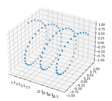
Now x ticks are [1.5, 3.5, 5.5, 7.5, 12.5, 14.5, 16.5, 18.5].
We can also update Y ticks and Z ticks using set_yticks() and z_ticks() methods respectively.
Read: Stacked Bar Chart Matplotlib
Matplotlib 3D scatter size
Here we will be going to learn how we can change the size of the 3D scatter plot. We can easily make our plots bigger or smaller than the default size.
The following ways are used to change the size of the plot:
- Using plt.figure() method
- Using set_size_inches() method
By using plt.figure() method
We pass the figsize parameter to the plt.figure() method to change the size of the plot. We must have to specify the width and height of the plot in inches.
The syntax for this is given below:
matplotlib.pyplot.figure(figsize(w,h))Here w and h specify width and height
Let’s see an example:
# Import librariesfrom mpl_toolkits import mplot3dimport numpy as npimport matplotlib.pyplot as plt # Define Datax = np.arange(0, 20, 0.2)y = np.sin(x)z = np.exp(8) # Change figure sizefig = plt.figure(figsize = (10, 7))ax = plt.axes(projection ="3d") # Create Plotax.scatter3D(x, y, z, marker='<', s=20)# Show plotplt.show()Here we use the figsize argument of plt.figure() method to change the figure size. We set w = 10 and h= 7.

By using set_size_inches() method
We pass the width and height of the plot in inches to the set_size_inches() method to modify the size of the plot.
The syntax for this is given below:
matplotlib.figure.Figure.set_size_inches(w,h)Here w and h specify width and height.
Let’s see an example:
# Import librariesfrom mpl_toolkits import mplot3dimport numpy as npimport matplotlib.pyplot as plt # Define Dataz = [3, 6, 9, 12, 15, 23, 14, 16, 21]x = [2, 4, 6, 8, 10, 13, 18, 16, 15]y = [5, 10, 15, 20, 25, 32, 29, 45, 20] # Change figure sizefig = plt.figure()fig.set_size_inches(10, 10)ax = plt.axes(projection ="3d") # Create Plotax.scatter3D(x, y, z)# Add axisax.set_xlabel('X-axis')ax.set_ylabel('Y-axis')ax.set_zlabel('Z-axis')# Show plotplt.show()Here we use the set_size_inches() method of the figure to modify the size of the plot.
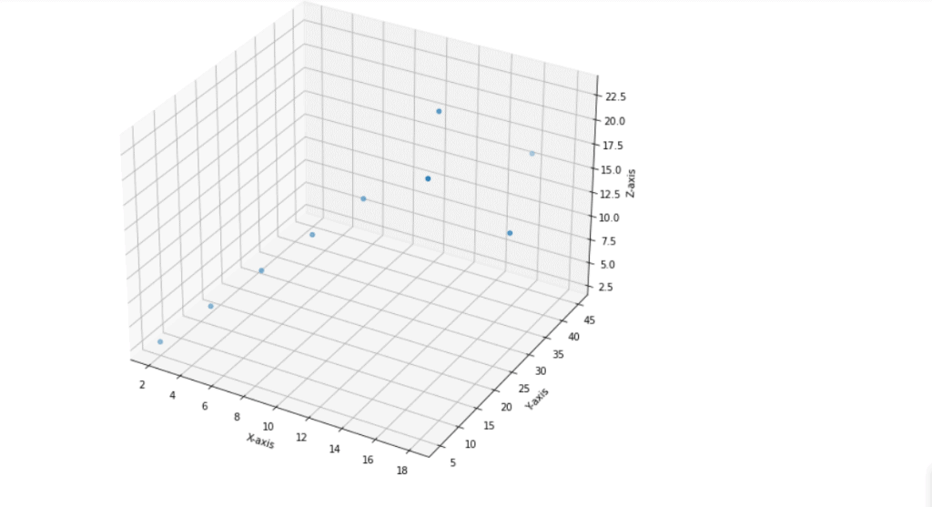
Here we set the width and height of the plot to 10 inches.
Read: Matplotlib two y axes
Matplotlib 3D scatter grid
When we plot a 3D scatter plot by default all the plots have gridlines. We can remove the grid lines if we want. To remove the grid lines, call the grid() method of the axes object.
Pass the value ‘False’ to remove gridlines and to get it back again pass the value ‘True’.
The syntax for this is given below:
matplotlib.axis.Axis.grid()Let’s see an example of a 3D scatter plot without a grid:
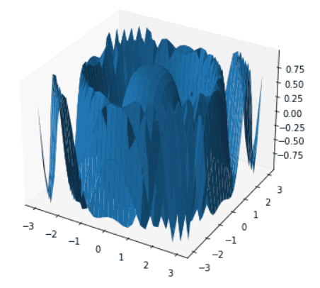
# Import librariesfrom mpl_toolkits import mplot3dimport numpy as npimport matplotlib.pyplot as plt# Define Functiondef function_z(x,y): return np.cos(x ** 2 + y ** 2)# Define Datax_val = np.linspace(-3, 3, 30)y_val = np.linspace(-3, 3, 30)X, Y = np.meshgrid(x_val, y_val)# Call functionz = function_z(X, Y)# Create figurefig = plt.figure(figsize =(10,6))ax = plt.axes(projection='3d')# Create surface plotax.plot_surface(X, Y, z);# Gridax.grid(False)# Displayplt.show()- In the above example, we define z-axis using user define function and x-axis, y-axis are define using linspace() method of numpy.
- Then we use ax.plot_surface() method to draw 3D scatter plot with surface.
- We use ax.grid() method and pass keyword False to turn off the grid lines.
Matplotlib 3D scatter subplot
Here we will discuss how we can plot a 3D scatter graph in one of the specific subplots out of multiple plots.
We use the scatter3D() method to create 3D scatter plot.
Let’s understand the concept with the help of an example:
# Importing Librariesimport numpy as npimport matplotlib.pyplot as pltfrom mpl_toolkits import mplot3d# Create 1st subplotfig = plt.figure(figsize=(8, 6))ax = fig.add_subplot(1, 2, 1, projection='3d')# Define Datax1= [0.2, 0.4, 0.6, 0.8, 1]y1= [0.3, 0.6, 0.8, 0.9, 1.5]z1= [2, 6, 7, 9, 10]# Plot graphax.scatter3D(x1, y1, z1, color='m')# Create 2nd subplotax = fig.add_subplot(1, 2, 2, projection='3d')# Define Datax2 = np.arange(0, 20, 0.2)y2 = np.sin(x)z2 = np.cos(x)# Plot graphax.scatter3D(x2, y2, z2, color='r')# Display graphfig.tight_layout()plt.show()- In the above example, by using add_subplot() method we create 1st subplot and then we define data used to for plotting.
- ax.scatter3D() method is used to create 3D scatter plot.
- After this, again we use add_subplot() method to create 2nmd subplot and then we define data which is used for plotting.
- Again, we use ax.scatter3D() method to plot another 3D scatter graph.

Matplotlib 3D scatter save
Here we are going to learn how we can save 3D scatter plots in our system memory. We save the 3D scatter plot in “png”.
To save it we use savefig() method of matplotlib and pass the path where you want to save it.
Let’s see an example:
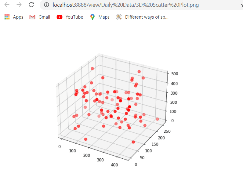
# Import librariesfrom mpl_toolkits import mplot3dimport numpy as npimport matplotlib.pyplot as plt# Define Datax1 = np.random.randint(450,size=(80))y1 = np.random.randint(260, size=(80))z1 = np.random.randint(490, size=(80))# Create Figurefig = plt.figure(figsize = (8,6))ax = plt.axes(projection ="3d") # Create Plotax.scatter3D(x1, y1, z1, s=50, color='red')# save plotplt.savefig('3D Scatter Plot.png')# Show plotplt.show()- In the above example, we use random.randit() method to define data and scatter3D() method to draw 3D scatter plot.
- Then we use plt.savefig() method to save plot in our system and we pass path as an argument to the function.
Matplotlib 3D scatter background color
set_facecolor() method in the axes module is used to change or set the background color of the plot.
It is used to set the face color of the figure or we can say the axes color of the plot. Pass the argument as a color name that you want to set.
figure(facecolor=’color’)method is used to change the outer background color of the plot.
The syntax to change the background color of the plot is below:
# Inner colormatplotlib.pyplot.axes.set_facecolor(color=None)# Outer color plt.figure(facecolor=None) Let’s understand the concept with the help of an example:
# Import librariesfrom mpl_toolkits import mplot3dimport numpy as npimport matplotlib.pyplot as plt # Define Datax = np.arange(0, 20, 0.2)y = np.sin(x)z = np.cos(x) # Create Figure fig = plt.figure(figsize = (8,8))# Set Outer colorplt.figure(facecolor='red')ax = plt.axes(projection ="3d")# Set Inner colorax.set_facecolor('yellow') # Create Plotax.scatter3D(x, y, z, marker= '>', s=50) # Show Plotplt.show()- In the above example, we have changed both theinnerandoutercolors of the background of the plot.
- The “facecolor”attribute is used inthe figure()method to change the outer area color.
- The “set_facecolor()”method of theaxes()object to change the inner area color of the plot.
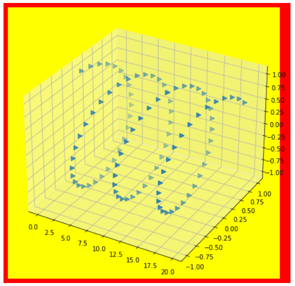
Here we set the inner color to “yellow” and the outer color to “red”.
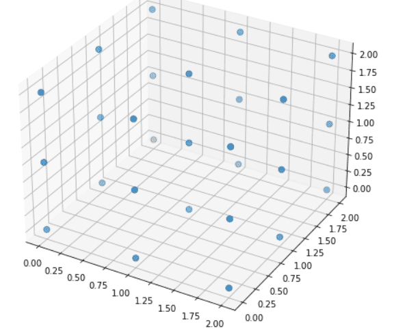
Matplotlib 3D scatter numpy array
Here we are going to learn how to create a 3D scatter plot using numpy array.
To define the three-dimensional data axis of the 3D scatter plot we use numpy methods.
Let’s see an example:
# Import librariesfrom mpl_toolkits import mplot3dimport numpy as npimport matplotlib.pyplot as plt# Create Figure fig = plt.figure(figsize = (8,8))ax = plt.axes(projection ="3d") # Define Data using numpydata = np.random.randint(2, 10, size=(3, 3, 3))x , y , z = data.nonzero()# Create Plotax.scatter3D(x, y, z, s=50) # Show plotplt.show()- In the above example, we create a 3D array using numpy and extra three-dimensional data points.
- Firstly, we import mplot3d, numpy, and pyplot libraries and then we create a new figure using the figure() method.
- By using the numpy random.randint() method we create data.
- Then by using the nonzero() method we extra x, y, and z data points to plot 3D scatter plot.
- Next, we use the ax.scatter3D() method to plot 3D scatter points on the created axis.
- To display the figure, we use the show() method.
Matplotlib 3D scatter marker color
Here we are going to learn how to change marker color in 3D scatter graph.
In 3D scatter plot the data points are represented by using points and these points are known as markers.
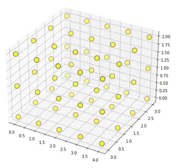
So, to change the color of the marker we simply pass color as an argument to the scatter3D() method, and to change the edge color of the marker we use edgecolor as an argument in the scatter3D() method.
The syntax to change color and edge color of the marker:
matplotlib.axis.Axis.scatter3D(x, y, z, color=None, edgecolr=None)The parameters used above are:
- x: specify x-axis coordinates.
- y: specify y-axis coordinates.
- z: specify z-axis coordinates.
- color: specify the color of the marker.
- edgecolor: specify the edge color of the marker.
Example:
# Import librariesfrom mpl_toolkits import mplot3dimport numpy as npimport matplotlib.pyplot as plt# Create Figure fig = plt.figure(figsize = (8,8))ax = plt.axes(projection ="3d")# Define Data using numpydata = np.random.random(size=(5, 4, 3))x , y , z = data.nonzero() # Create Plot and set color and edge colorax.scatter3D(x, y, z, s=150, color='yellow', edgecolor='black') # Show plotplt.show()- In the above example, we use the scatter3D() method and pass a color argument to set marker color. Here we set the color of the marker to “yellow”.
- We also pass the edgecolor argument to the scatter3D() method to change the color of the edges of the markers. Here we set the edgecolor of the marker to “black”.
Matplotlib 3D scatter zlim
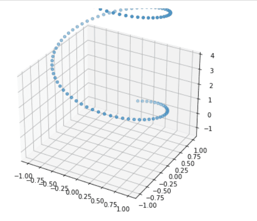
set_zlim() method is used to set limits of the z-axis.
The syntax of the zlim() method is given below:
matplotlib.axis.Axis.set_zlim(min, max)Let’s see examples of the zlim() method:
Example 1
# Import Libraryfrom mpl_toolkits import mplot3dimport numpy as npimport matplotlib.pyplot as plt# Plotting 3D axis figuresfig = plt.figure(figsize = (8, 6))ax = plt.axes(projection = '3d') # Define Dataz = np.linspace(0,15,150)x = np.sin(z)y = np.cos(z)# Plot 3D scatter ax.scatter3D(x, y, z)# zlim() methodax.set_zlim(-1.5, 4)# Displayplt.show()Here we use the set_zlim() method to set limits of the z-axis. We set the minimum limit to -1.5 and the maximum limit to 4.
Example 2
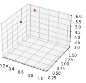
# Importing Librariesimport numpy as npimport matplotlib.pyplot as pltfrom mpl_toolkits import mplot3d# Create figurefig = plt.figure(figsize=(8, 6))ax = fig.add_subplot(1, 2, 1, projection='3d')# Define Datax= [0.2, 0.4, 0.6, 0.8, 1]y= [0.3, 0.6, 0.8, 0.9, 1.5]z= [2, 6, 7, 9, 10]# Plot graphax.scatter3D(x, y, z, color='m', depthshade=False)# zlim() methodax.set_zlim(3, 6)# Displayplt.show()In the above example, we use the set_zlim() method to set the minimum and maximum limit of the z-axis. Here we set a range from 3 to 6.
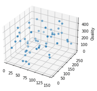
Matplotlib 3D scatter zlabel
set_zlabel() method is used to add a label to the z-axis of the plot.
The syntax of zlabel() method:
matplotlib.axis.Axis.set_zlabel()Let’s see examples of the zlabel() method:
Example:
# Import Libraryfrom mpl_toolkits import mplot3dimport numpy as npimport matplotlib.pyplot as plt# Plotting 3D axis figuresfig = plt.figure(figsize = (4,6))ax = plt.axes(projection = '3d') # Define Datax = np.random.randint(150, size=(50))y = np.random.randint(260, size=(50))z = np.random.randint(450, size=(50))# Plot ax.scatter3D(x, y, z, 'green')# zlabel()ax.set_zlabel('Quality')# Displayplt.show()In the above example, we use the set_zlabel() method to add a label to the z-axis.
Matplotlib 3d scatter xlim
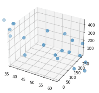
set_xlim() method is used to set limits of the x-axis.
The syntax of the xlim() method is given below:
matplotlib.axis.Axis.set_xlim(min, max)Let’s see examples of the xlim() method:
# Import Libraryfrom mpl_toolkits import mplot3dimport numpy as npimport matplotlib.pyplot as plt# Plotting 3D axis figuresfig = plt.figure(figsize = (4,6))ax = plt.axes(projection = '3d') # Define Datax = np.random.randint(150, size=(50))y = np.random.randint(260, size=(50))z = np.random.randint(450, size=(50))# Plot ax.scatter3D(x, y, z, s=60)# xlim()ax.set_xlim(35,62)# Displayplt.show()Here we use the set_xlim() method to set the limit. We set its range between 35 to 62.
Matplotlib 3D scatter zoom
In matplotlib zoom() method is used to zoom in or out on axes.
The syntax of the zoom() method is given below:
matplotlib.axis.Axis.zoom(self, direction)Here direction>0 is used for zoom in and direction<=0 is used for zoom out.
Let’s see an example:
Code:
# Importing Librariesimport numpy as npimport matplotlib.pyplot as pltfrom mpl_toolkits import mplot3d# Create 1st subplotfig = plt.figure(figsize=(8, 6))ax = fig.add_subplot(1, 2, 1, projection='3d')# Define Datax1= [0.2, 0.4, 0.6, 0.8, 1]y1= [0.3, 0.6, 0.8, 0.9, 1.5]z1= [2, 6, 7, 9, 10]# Plot graphax.scatter3D(x1, y1, z1, color='m', depthshade=False)# For zoomax.xaxis.zoom(-2.5)# Displayplt.show()- In the above example, we import numpy, pyplot, and mplot3d libraries.
- Then we create a figure by using the figure() method and define data using random.randint() method of numpy.
- ax.scatter3D() method is used to draw 3D scatter graph.
- Then we use the zoom() method for zoom in and zoom out of axes.
Output:
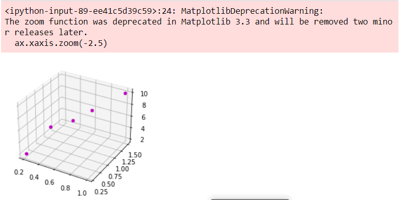
You will get a warning like that because the zoom() method was deprecated from matplotlib 3.3
Matplotlib 3D scatter origin
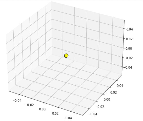
In matplotlib, we can get the origin of 3D to scatter origin. To get an origin we use the zeros() method of the NumPy library.
Let’s see an example:
# Import librariesfrom mpl_toolkits import mplot3dimport numpy as npimport matplotlib.pyplot as plt# Create Figure fig = plt.figure(figsize = (8,8))ax = plt.axes(projection ="3d")# Define Data x , y , z = np.zeros((3,3)) # Create Plot and set color and edge colorax.scatter3D(x, y, z, s=150, color='yellow', edgecolor='black') # Show plotplt.show()- In the above example, we import libraries mplot3d, numpy, and pyplot of matplotlib.
- Then we create a figure by using the figure() method.
- After this, to get the origin of the 3D scatter plot we use the np.zeros() method.
- ax.scatter3D() method is used to draw scatter plots in the 3D plane.
Matplotlib 3D scatter log scale
Here we are going to learn how we can set axis scales value to log scale.
Let’s see an example of 3D scatter with a log scale:
# Import librariesfrom mpl_toolkits import mplot3dimport numpy as npimport matplotlib.pyplot as pltimport matplotlib.ticker as mticker# Define Functiondef function_z(x,y): return 100 - (x**2 + y**2)# Define Datax_val = np.linspace(-3, 3, 30)y_val = np.linspace(-3, 3, 30)X, Y = np.meshgrid(x_val, y_val)# Call functionz = function_z(X, Y)# Create figurefig = plt.figure(figsize =(10,6))ax = plt.axes(projection='3d')# Create surface plotax.plot_surface(X, Y, z, color='yellow');# Log Scaledef log_tick_formatter(val, pos=None): return f"$10^{{{int(val)}}}$"ax.zaxis.set_major_formatter(mticker.FuncFormatter(log_tick_formatter))ax.zaxis.set_major_locator(mticker.MaxNLocator(integer=True))# Set Titleax.set(title="Logarithmic z-aix")# Displayplt.show()- In the above example, we import mplot3d, numpy, pyplot, and ticker libraries of matplotlib.
- Then we create user-define function to define the z coordinate.
- After this, we define x and y coordinates and create figure using the figure() method.
- ax.plot_surface() method is used to create surface plot in 3D.
- Then we create user-define function to create a major locator and we define ticks in log form.
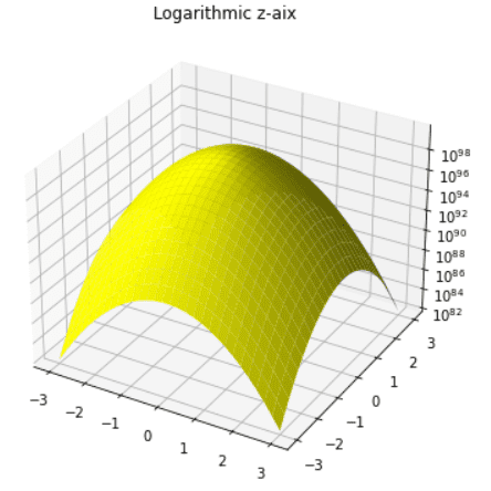
Here we set the z-axis in form of a log.
Matplotlib 3D scatter Dataframe
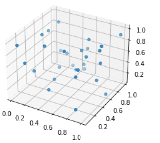
Here we are going to learn how can we create a 3D scatter plot by using pandas data frame.
Let’s see an example:
# Import Libraryimport matplotlib.pyplot as pltimport numpy as npimport pandas as pdfrom mpl_toolkits import mplot3d# Create figurefig = plt.figure(figsize = (4,6))ax = plt.axes(projection = '3d')# Define dataframedf=pd.DataFrame(np.random.rand(30,20))x = df.iloc[:,0]y = df.iloc[:,5]z = df.iloc[:,10]# Plot 3d Scatter Graphax.scatter3D(x,y,z)# Displayplt.show()- In the above example, we import pyplot, numpy, pandas, and mplot3d library in matplotlib.
- After this, we create figures by using the figure() method and define projection in 3D.
- Then we create pandas DataFrame and we use np.random.rand() method.
- We define x, y, and z data coordinates by using iloc() method of dataframe in pandas.
- ax.scatter3D() method is used to create 3D scatter graph.
Read: Matplotlib 2d surface plot
Matplotlib 3D scatter animation
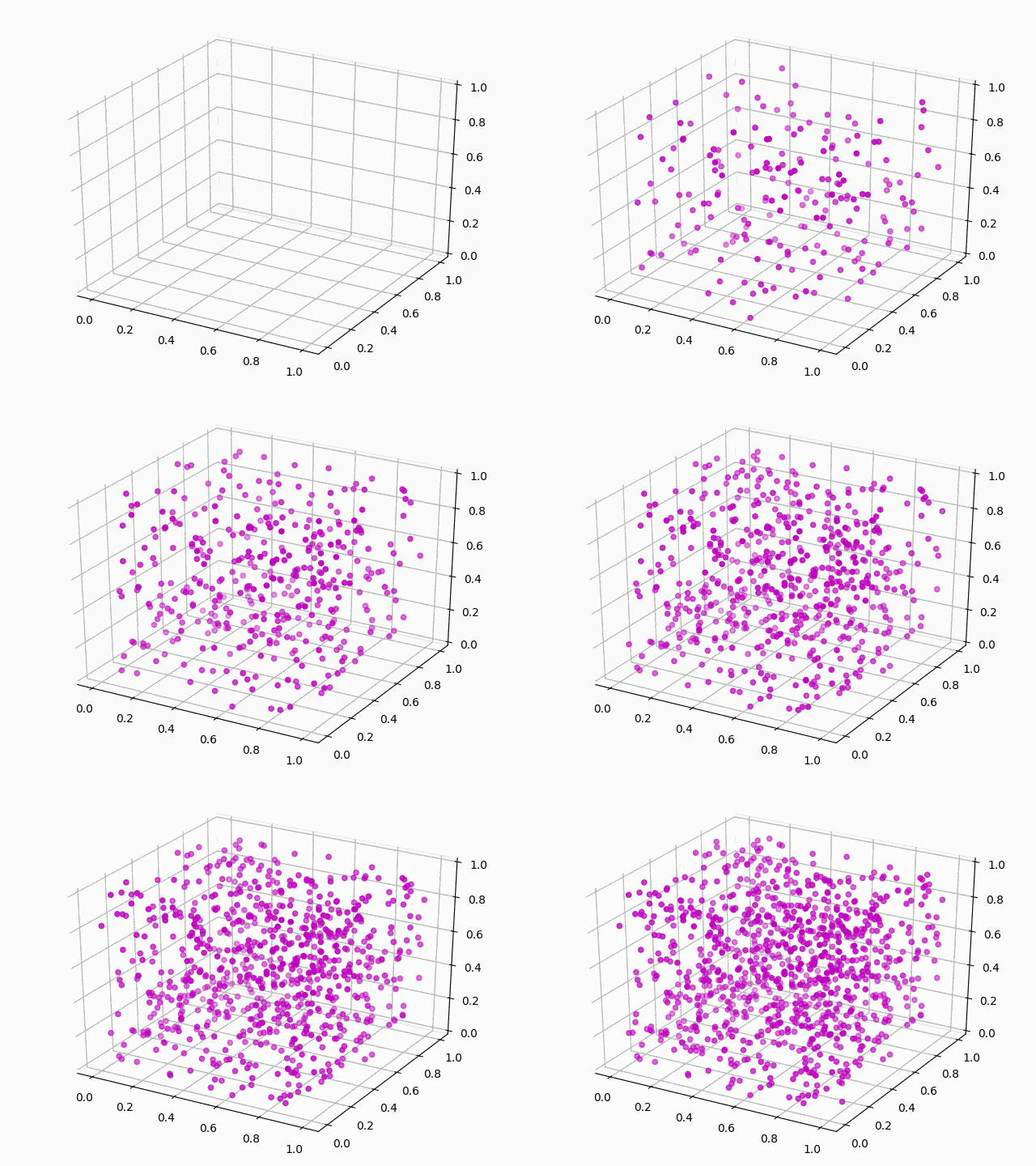
Here we are going to learn how we can create a 3D scatter plot with animations.
Let’s see an example of an animated 3D Scatter Plot:
# Interactive Mode%matplotlib notebook# Import Libraryimport pandas as pdimport numpy as npimport matplotlib.pyplot as pltfrom mpl_toolkits.mplot3d import Axes3Dfrom matplotlib.animation import FuncAnimation, PillowWriter # Define Datadata = np.random.random(size=(1000,3))df = pd.DataFrame(data, columns=["x","y","z"])# Create Figurefig = plt.figure()ax = fig.add_subplot(111,projection='3d')# Plot Graphscatter_plot = ax.scatter3D([],[],[], color='m')# Define Update functiondef update(i): scatter_plot._offsets3d = (df.x.values[:i], df.y.values[:i], df.z.values[:i])# Set annimationani = matplotlib.animation.FuncAnimation(fig, update, frames=len(df), interval=50)# Showplt.tight_layout()plt.show()# Saveani.save('3D Scatter Animation.gif', writer='pillow', fps=30)- In this above example, we firstly enable Interactive Mode.
- Then we import pandas, numpy, pyplot, mplot3d, and animation libraries of matplotlib.
- Next, we define data using random.random() method of numpy.
- After this, we create DataFrame in pandas and define x, y, and z coordinates.
- plt.figure() method is used to create a figure and add_subplot() method create subplot and we set the projection to 3D.
- ax.scatter3D() method is used to draw 3D scatter plot.
- After this, we create an update function.
- By using animation.FuncAnimation() method we add animation in the 3D Scatter Plot.
- Then, at last, we use the save() method to save a plot as a gif.
In this Python tutorial, we have discussed the“Matplotlib 3D Scatter”and we have also covered some examples related to it. These are the following topics that we have discussed in this tutorial.
- Matplotlib 3D scatter plot
- Matplotlib 3D scatter plot example
- Matplotlib 3D scatter color
- Matplotlib 3D scatter with colorbar
- Matplotlib 3D scatter marker size
- Matplotlib 3D scatter label
- Matplotlib 3D scatter legend
- Matplotlib 3D scatter plot color by value
- Matplotlib 3D scatter rotate
- Matplotlib 3D scatter change view angle
- Matplotlib 3D scatter title
- Matplotlib 3D scatter text
- Matplotlib 3D scatter with line
- Matplotlib 3D scatter with surface
- Matplotlib 3D sactter transparency
- Matplotlib 3D sactter depthshade
- Matplotlib 3D scatter axis limits
- Matplotlib 3D scatter axis ticks
- Matplotlib 3D scatter size
- Matplotlib 3D scatter grid
- Matplotlib 3D scatter subplot
- Matplotlib 3D scatter save
- Matplotlib 3D scatter background color
- Matplotlib 3D scatter numpy array
- Matplotlib 3D scatter marker color
- Matplotlib 3D scatter zlim
- Matplotlib 3D scatter z label
- Matplotlib 3D scatter xlim
- Matplotlib 3D scatter zoom
- Matplotlib 3D scatter origin
- Matplotlib 3D scatter log scale
- Matplotlib 3D scatter dataframe
- Matplotlib 3D scatter animation

Bijay Kumar
I am Bijay Kumar, a Microsoft MVP in SharePoint. Apart from SharePoint, I started working on Python, Machine learning, and artificial intelligence for the last 5 years. During this time I got expertise in various Python libraries also like Tkinter, Pandas, NumPy, Turtle, Django, Matplotlib, Tensorflow, Scipy, Scikit-Learn, etc… for various clients in the United States, Canada, the United Kingdom, Australia, New Zealand, etc. Check out my profile.